Peaches Pilates

Peaches is your feel-good, total fitness experience, built on energy, confidence and community. From their signature mat pilates to squad-level run clubs, Peaches serves up movement and an attitude that you can’t get enough of. More than a workout, it’s an immersive lifestyle designed to live beyond the studio, turning each of their spaces into a culturally-connected community.
Peaches Pilates
Pilates, Served Peachy


The Problem
The Problem
The Problem
The Problem
Peaches has always had the culture, the loyalty, the vibes. What it needed was a cohesive brand system that would support growth, and hold everything together without holding it back. With expansion on the horizon and multiple franchise agreements on the table, bringing their studio count to 13+, it was time to dial up their brand identity and create a future-proof playbook.
The Problem
Our solution was to peel back the layers to create a consistent yet flexible brand identity that brings the core of what Peaches has always been to the forefront. Through sharpening their positioning, unifying how the brand shows up, and creating consistency across studios, the new visual and verbal identity turns Peaches up to a new level without losing what has always made them so unapologetically themselves.
The Problem
The Problem
The Problem
The Problem
The Problem
The Problem
Project Details
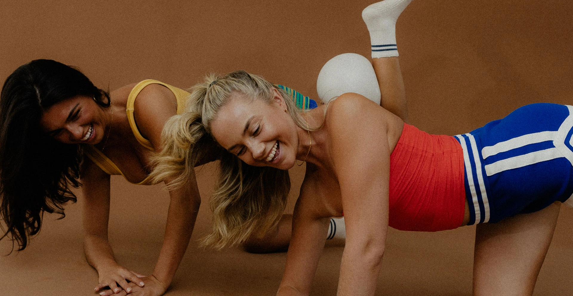
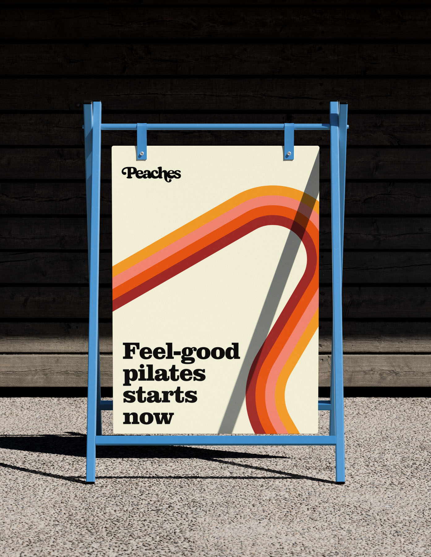
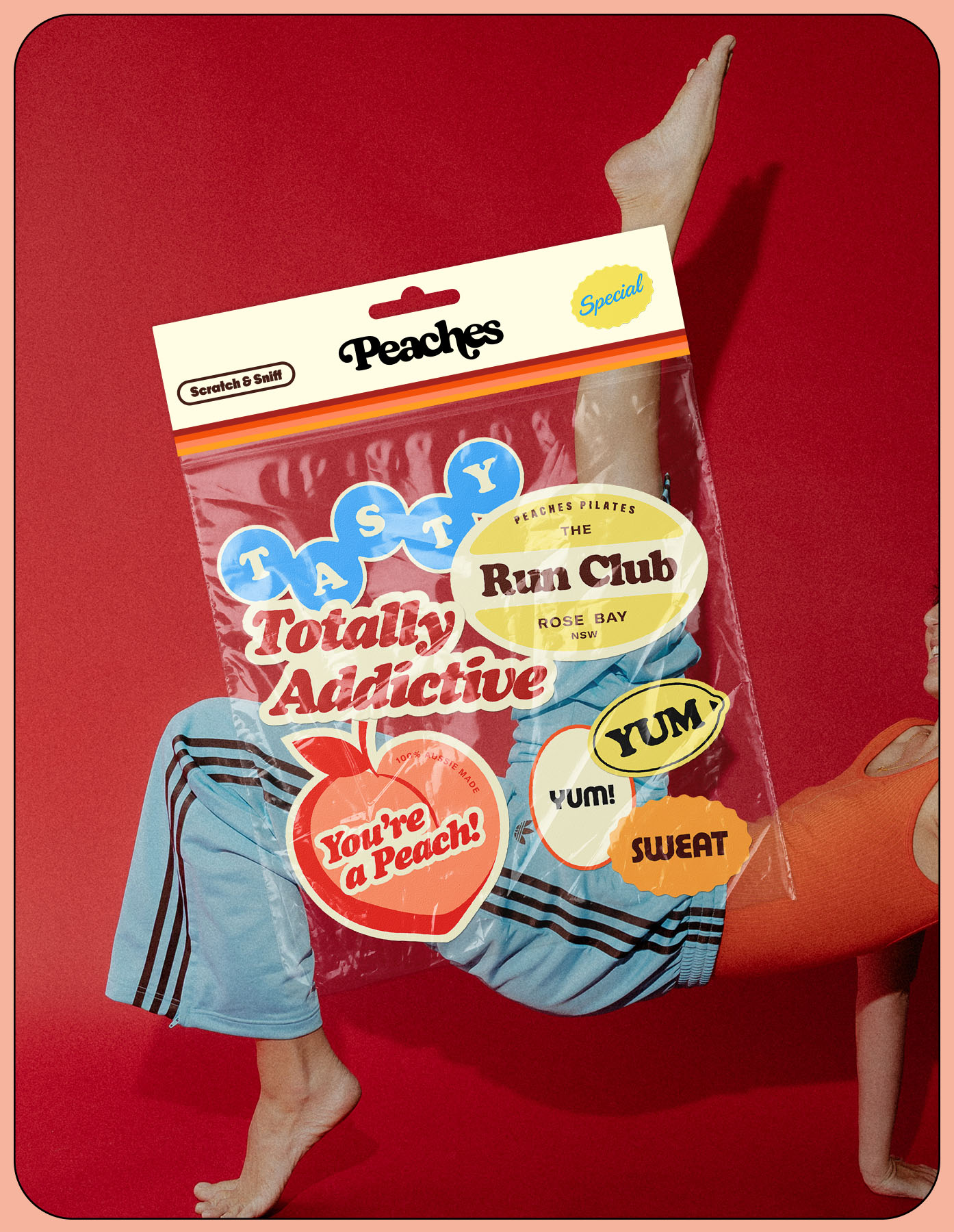
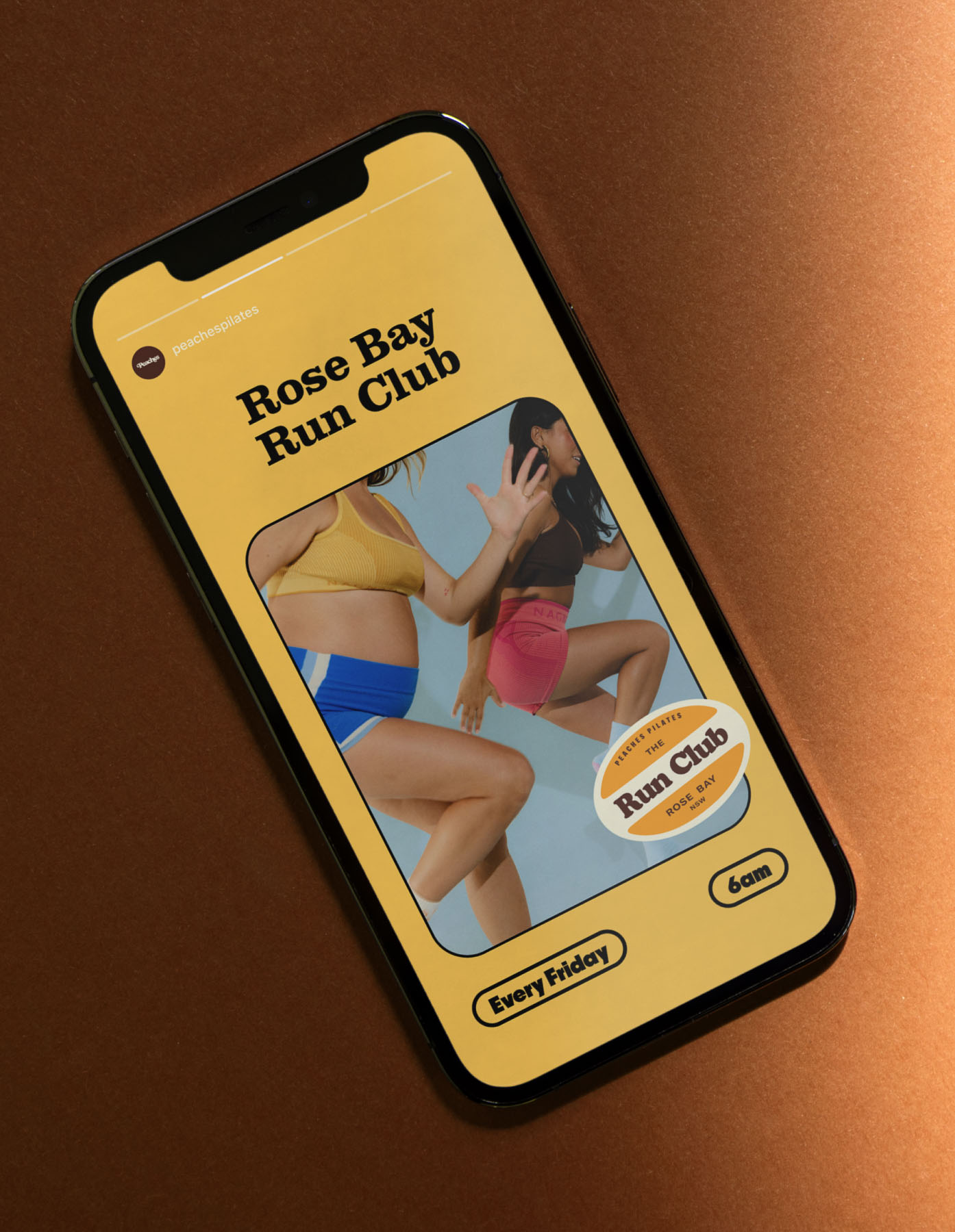
The identity dials up Peaches’ signature attitude with a bold, self-assured type suite, an irresistible colour palette, a retro-inspired graphic system, and iconic art direction in full colour.
The refreshed colour palette brings main-character energy with a soft nod to nostalgia. Juicy pinks, warm peaches and cherry reds bring the heat, balanced with thirst-quenching blues, keeping it real and relatable (think Aussie summer meets Video Ezy). These colours don’t whisper wellness, they shout ready to burn.
The graphic system is retro, cult, and cool: old-school frames, nostalgic fruit stickers, and synthwave-inspired patterns all embody that post-class high. These assets allow the brand to effortlessly balance structure with play.
These elements work together to amplify the Peaches personality and confidence that has always been at the heart of the brand. The result is a scalable brand system that holds its own at every level, from in-studio experiences through to digital and community-led interactions. With more colour, more fun, more energy, the new identity turns Peaches all the way up without losing what has always made them so unapologetically themselves.
Year
2026
Collaborators
Creative Direction
Ashleigh Stewart
Strategy, Visual Identity
Ashleigh Stewart & Nina Szewczyk
Digital & Print Design
Alanna Walsh, Elsie Gibbs & Nina Szewczyk
Photography
Emma Tkalcevic
Services
Strategy
Brand Positioning, Brand Architecture, Taglines, Brand Narrative, Tone of Voice
Visual Identity
Brand Identity, Logo & Wordmark, Iconography, Illustration
Print & Digital Design
Social Media Design, EDM Marketing, Signage